In many businesses, where IT is struggling to keep up with businesses data demands, rifts are developing between business users and IT. Rightly or wrongly more business users are assuming ownership of data and Business Intelligence and creating their own reports and dashboards in a “Self-Service” manner 1 . This demand has contributed to the rise of a new category of BI tools that fall under a category called Visual Analytics, or Visual Data Discovery. For purpose of brevity, let’s just use the shorter first name.
What is Visual Analysis?
Bill chamberlain of Horizon watching described Data visualization as “all about presenting detailed insights in a visual way that helps individuals make faster and better decisions. 4 . More technically, Gartner Research (2011) 5 has characterized Data Visualization tools as having three core features:
• An intuitive interface that enables users to explore data without much training.
• A proprietary data structure to store and model data gathered from disparate sources, which minimizes reliance on predefined drill paths and dimensional hierarchies.
• A built-in performance layer that obviates the need for aggregates, summaries, and pre-calculations.
Segment Growth
Visual analytics now accounts for approximately 5 % of the $13B per annum Business Intelligence (BI) Market 5, but it fights well above its weight in terms of profile (more about this later). In recent years the segment has grown at a compound annual growth rate of approximately 30% 6 .
The category has been dominated by what have been until recently have been described as niche players in the BI market. These vendors Qlikview, Tibco Spotfire, and Tableau have, in the space of only 5-6 years, moved relative obscurity into the leader’s quadrant in Gartner’s 2014 BI Magic Quadrant analysis (Figure 1). While many mega vendors appear to have been caught off guard by the demand for these tools, most including Microsoft, SAP, SAS are now developing offerings, albeit with some mixed reviews 7.
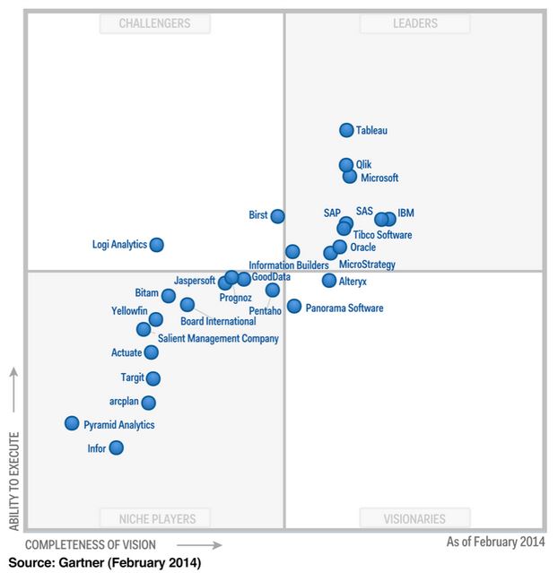
Figure 1. Gartner’s Magic Quadrant analysis of Business Intelligence vendors (2014).
In a recently released survey of TDWI, one-third (33%) of respondents to the survey for this report said that they are currently implementing data visualization for discovery and analysis, and 45% are planning to do so 8 . Gartner 9 has identified several factors driving these impressive figures.
- Usability —Usability is the No. 1 selection criterion when choosing BI tools, according to Gartner’s “Magic Quadrant for Business Intelligence Platforms. Strong visualization capabilities, intuitive user interfaces and fast query times put visualization tools in this usability sweet spot.
- Time to deliver — a light footprint, SaaS and cloud based solutions are common in this category. This means these tools can typically be deployed quicker than traditional BI platforms. This is particularly attractive for departmental size implementations where enterprise scale BI solutions can feel like an overkill, or the end users have little or no say in broader technology decisions.
- The promise of being able to cut through to answers. Visualization–based analytics are often sold on the promise of being flexible enough to answer multiple questions and ultimately answer business problems much quicker than traditional BI tools.
- Rapid prototyping. An upswing in the adoption of agile methodologies has set the stage for rapid prototyping to be done in data discovery tools. Often user friendly Graphical User Interfaces (GUI) mean a business user can generate analyses that traditionally have only be possible with help from IT.
- Focus on business users as opposed to IT/developers. This has opened up a new, largely untapped segment for Business Intelligence.
- Mobile BI. Most visualization tools have been developed with mobile devices in mind. The tap and swipe functionality of tablets are perfectly suited to visual-analysis.
- Performance. Improvements in computer processing and the move to 64 bit has enabled data discovery tools to store and manipulate large amounts of information in-memory, freeing it from large underlying information infrastructures.
- Viral spread. Users who like working in the data discovery tools recommend it to their peers and take it with them when they move to new roles and responsibilities.
Visual analytics tools provide businesses the opportunity to kill two birds with one stone. First by enables users to create their own reports decreasing development time. Second, if offloads report development tasks from the BI team so they can focus on the technically challenging task of making data available.
Barriers and risks with Visual Analytics
Visual analytics tools, however, aren’t without their risks and challenges.
- Report proliferation. If unchecked, users can create hundreds or thousands of reports across departmental silos. If they aren’t stored, managed, tracked, and controlled, using a central portal incorrect or outdated reports will proliferate and cause problems.
- Inconsistent metrics and definitions. Report proliferation is synonymous with inconsistent metrics and definitions.
- Licencing cost. Licencing costs are often range between $500 – 1500 per user, depending on whether users are report authors or just report consumers. This is typical much high cost than more traditional reporting tools, such as SQL Server Reporting Services. As such the cost to providing access to a large number of users can quickly escalate is unchecked.
- Support & infrastructure cots. Implementing a new analytics tool to require funding and resources. Selecting the right tool takes time and money, users require training, new hardware may need to purchased, and licencing needs to be tracked and managed.
- Distraction. While business users need data to make decisions, access to the ability to self- serve analytics shouldn’t result in analytics distracting them from their roles core function.
Suggested strategies to streamline the implementation of Visual Analytics.
It’s essential to recognise potential pitfalls, and build a plan to mitigate risk. The following strategies are a good starting point (Figure 2).
• Data should be stored, controlled and governed centrally. A central Business Intelligence team should manage technical tasks such as data integration, metadata management, data quality, training, testing, and publishing of the sanctioned data feeds. At the same time, however, business users should be actively involved in the overarching data governance process.
• IT – Super Business User – User model. In this model “Super Users” in departments are trained by IT/ BI to develop rich / multidimensional dashboards for users within their departments. This ensures users have ready access to developers with relevant subject matter expertise to generate reports, and typically reduces report turnaround time. Minimising IT’s involvement in generating visual analytics dashboards further frees up IT to make more data feeds available for reporting. This model also reduces the need for expensive developer licences, and shifts the majority of users to lower cost “viewer or interactor” licences.
• Super Users act as a first line of support for reports they create. Only if Super Users can’t resolve issues, are they then escalated to IT.
• A central data dictionary is used to standardize definitions used in reporting. Super Users are required to stick to these officially sanctioned definitions, or submit requests to a data governance group.
• Reports are stored and managed by IT in a central hub or portal. This allows auditing, quality control, and use to be monitored and managed. Reports duplicated across departments can be merged.
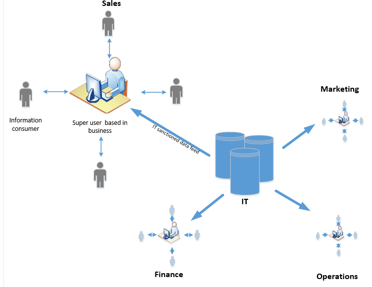
Figure 2. IT – Super Business User – User Model reporting model